 |
 |
 |
 |
 |
The plan for simplifying and improving our alphabet, entitled "Alphabet 26," was first presented in Westvaco Inspirations 180 in 1950. It recommended the use of only one symbol for each of the 26 letters.
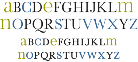
Our conventional alphabet contains 19 letters having dissimilar upper and lower case symbols (such as 'A' and 'a') and 7 letters (c-o-s-v-w-x-z) having symbols that are identical. It is misleading for a letter, or for any graphic symbol, to have two different designs. Confusion might set in when school children are taught to recognize words even before they have learned to recognize different symbols for the same letter.
To remedy this, Alphabet 26, a plan based upon the logic of consistency, proposed that of the 19 letters that have dissimilar symbols 15 letters should use the uppercase designs [black letters below] and 4 letters should use the lowercase designs [green letters]. The other 7 letters already have identical symbols [blue letters]. Alphabet 26 provides the necessary large letters for emphasis at the beginning of the sentence and for denoting proper nouns, an advantage over the exclusive use of an all lowercase alphabet, as recommended at the Bauhaus.
The Alphabet 26 plan is applicable to all type families. The choice of Baskerville to introduce Alphabet 26 in Inspirations 180 was made for tactical, historical, and practical reasons. To appeal to as broad a segment of readers as possible, it seemed prudent to present this radical change in our time-honored alphabet with a traditional typeface rather than an extreme one, such as Futura, or even a modern one such as Bodoni. An old style typeface such as Garamond would likewise be inappropriate.
Alphabet 26 provided an impetus in the fifties and sixties for lettering artists to enliven the typographic scene with the design of biform alphabets. These were unusual combinations of capital and lowercase letters within a single word or font, valued more for their visual interest and attention-getting qualities than for contributing to a simplified alphabet. Alphabet 26 also provided designers with an immediate means to produce many useful trademarks.
Implicit in the republication of Alphabet 26 is the hope that it might prompt typeface designers and manufacturers to produce it for general use and trial. An equally important hope is that it might suggest a solution for another simplified alphabet in the future. Such a challenge could do no less than provide an enjoyable project for some young designer, as it did for the author thirty-eight years ago in Westvaco Inspirations 180.